Every Picture Is a Compromise
Lessons from the Also-rans
Most photography websites show the photographer's very best work. Wonderful. But that's not the full story of a creative life. If we want to learn, we'd better pay attention to the images that aren't "greatest hits" and see what lessons they have to offer. Every picture is a compromise — the sum of its parts, optical, technical, visual, emotional, and even cosmic – well, maybe not cosmic, but sometimes spiritual. Success on all fronts is rare. It's ok to learn from those that are not our best.
This is a series about my also-rans, some of which I've been able to improve at bit (i.e., "best effort"), none of which I would consider my best. With each there are lessons worth sharing, so I will.
|
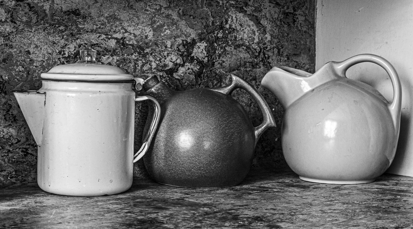
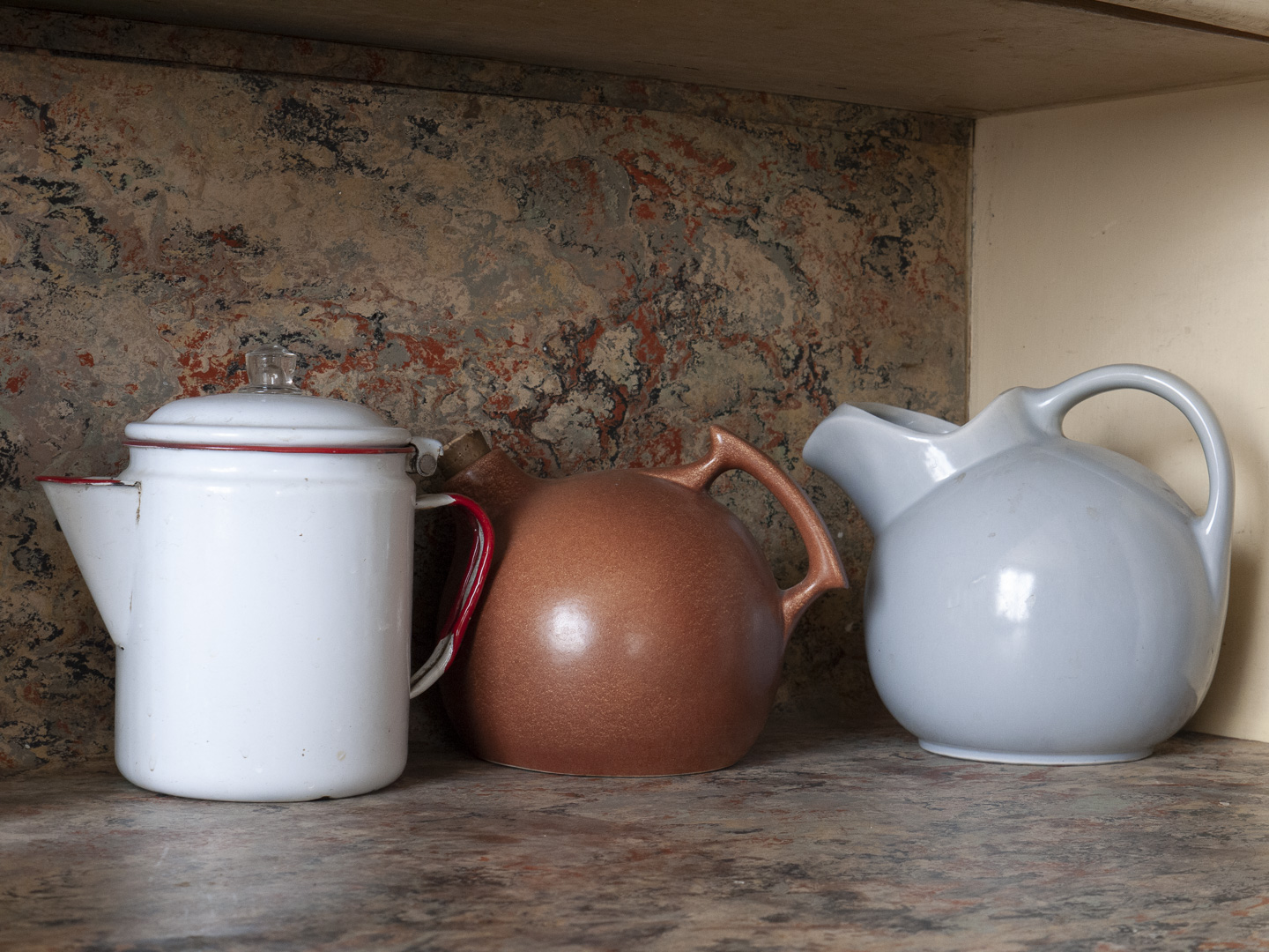
Original digital capture
What I saw that I liked:Cute and nostalgic three pots. What I don't like in the picture:A little crop, a conversion to b/w —YIKES. That background is awful. What I learned:Conversion to b/w is trickier than it might seem at first blush. In this case, the relatively muted colors on that back wall became a contrast intensive yuck. It was shortly after I was back home and looking at these images that I made a strategic change in my default camera settings. I now have the camera's monitor/eyepiece set to display b/w by default. I reprogramed one of my customizable buttons to revert to color display if I need it. By seeing b/w on my monitor/eyepiece, I've been able to avoid this ugly surprise from happening again. 2nd Chances: What I might try nextFancy selections and deeply darkening the background wall? |