Every Picture Is a Compromise
Lessons from the Also-rans
Most photography websites show the photographer's very best work. Wonderful. But that's not the full story of a creative life. If we want to learn, we'd better pay attention to the images that aren't "greatest hits" and see what lessons they have to offer. Every picture is a compromise — the sum of its parts, optical, technical, visual, emotional, and even cosmic – well, maybe not cosmic, but sometimes spiritual. Success on all fronts is rare. It's ok to learn from those that are not our best.
This is a series about my also-rans, some of which I've been able to improve at bit (i.e., "best effort"), none of which I would consider my best. With each there are lessons worth sharing, so I will.
|
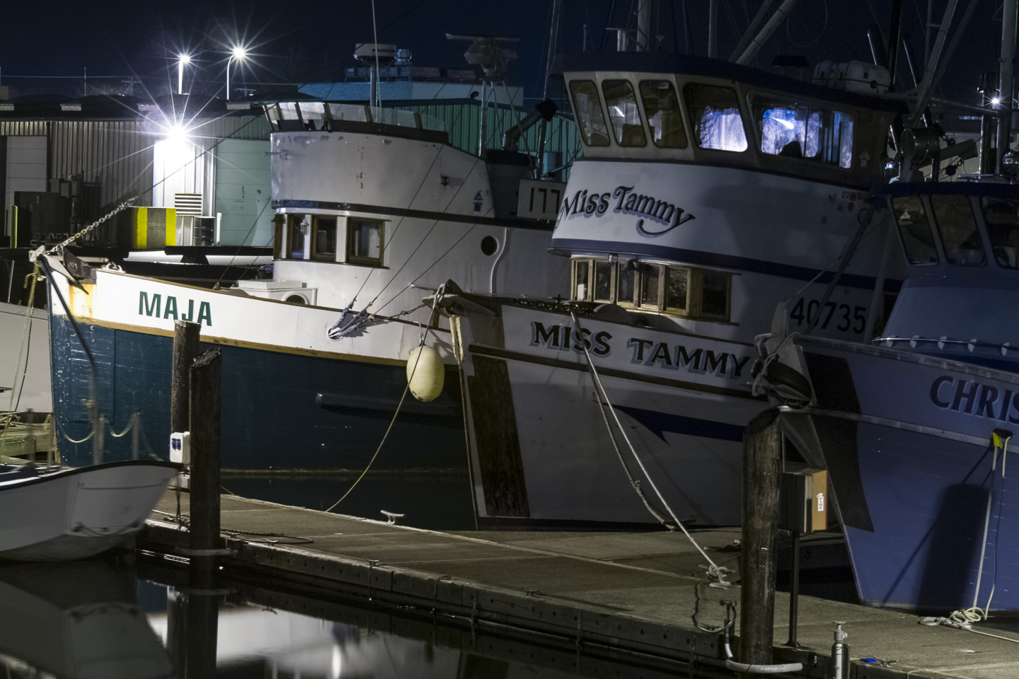
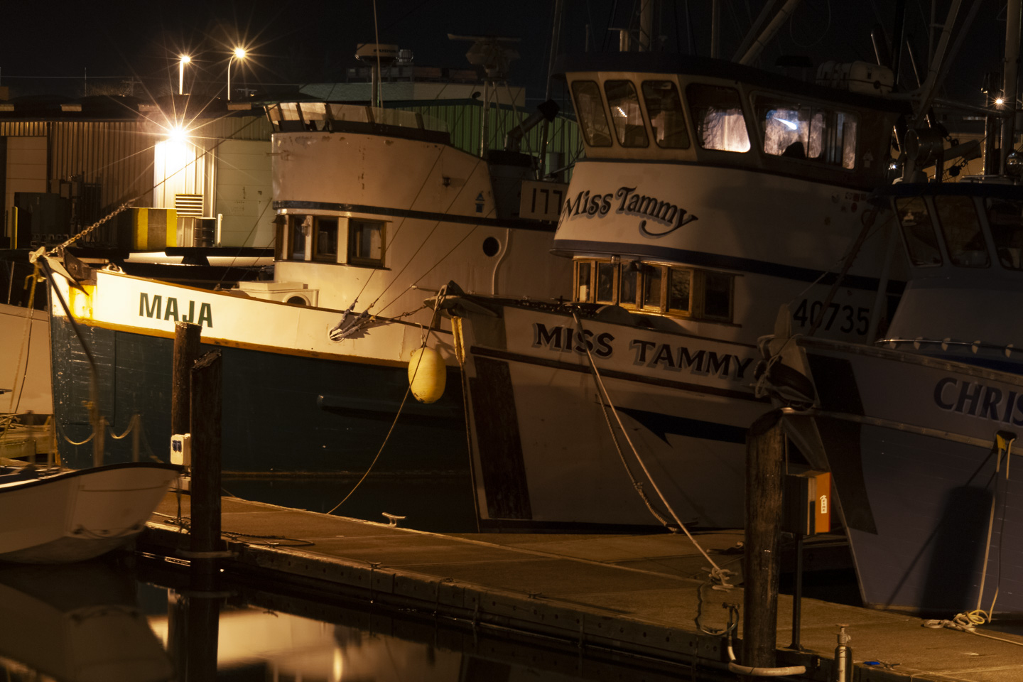
Original digital capture
What I saw that I liked:A 2006 night time walk on the boat docks, just for fun and to try something new. What I don't like in the picture:I was and still am primarily a b/w photographer, but since going digital, I began to play around with color. I remember being quite surprised to see the orange cast in the above — one of my first lessons in color balance and different light sources. What I learned:I "fixed" the orange color balance in the image at left. But did I really? Did I "fix" it or did I just reflexively eliminate part of the night time mood? Said another way, is the goal of color balance always to make the subject look like it does to our eyes? Or are there times when it's better to keep the color unnatural so it emphasizes the time and place? I've looked at this image for years in my Lightroom catalog and come to realize I like the orange one better! 2nd Chances: What I might try nextCan I nudge the orange, original color balance a tad in one direction or another and make it even better? |