Every Picture Is a Compromise
Lessons from the Also-rans
Most photography websites show the photographer's very best work. Wonderful. But that's not the full story of a creative life. If we want to learn, we'd better pay attention to the images that aren't "greatest hits" and see what lessons they have to offer. Every picture is a compromise — the sum of its parts, optical, technical, visual, emotional, and even cosmic – well, maybe not cosmic, but sometimes spiritual. Success on all fronts is rare. It's ok to learn from those that are not our best.
This is a series about my also-rans, some of which I've been able to improve at bit (i.e., "best effort"), none of which I would consider my best. With each there are lessons worth sharing, so I will.
|
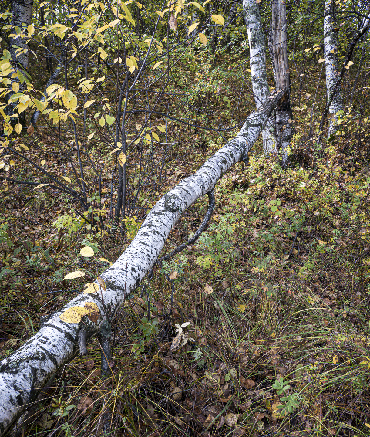
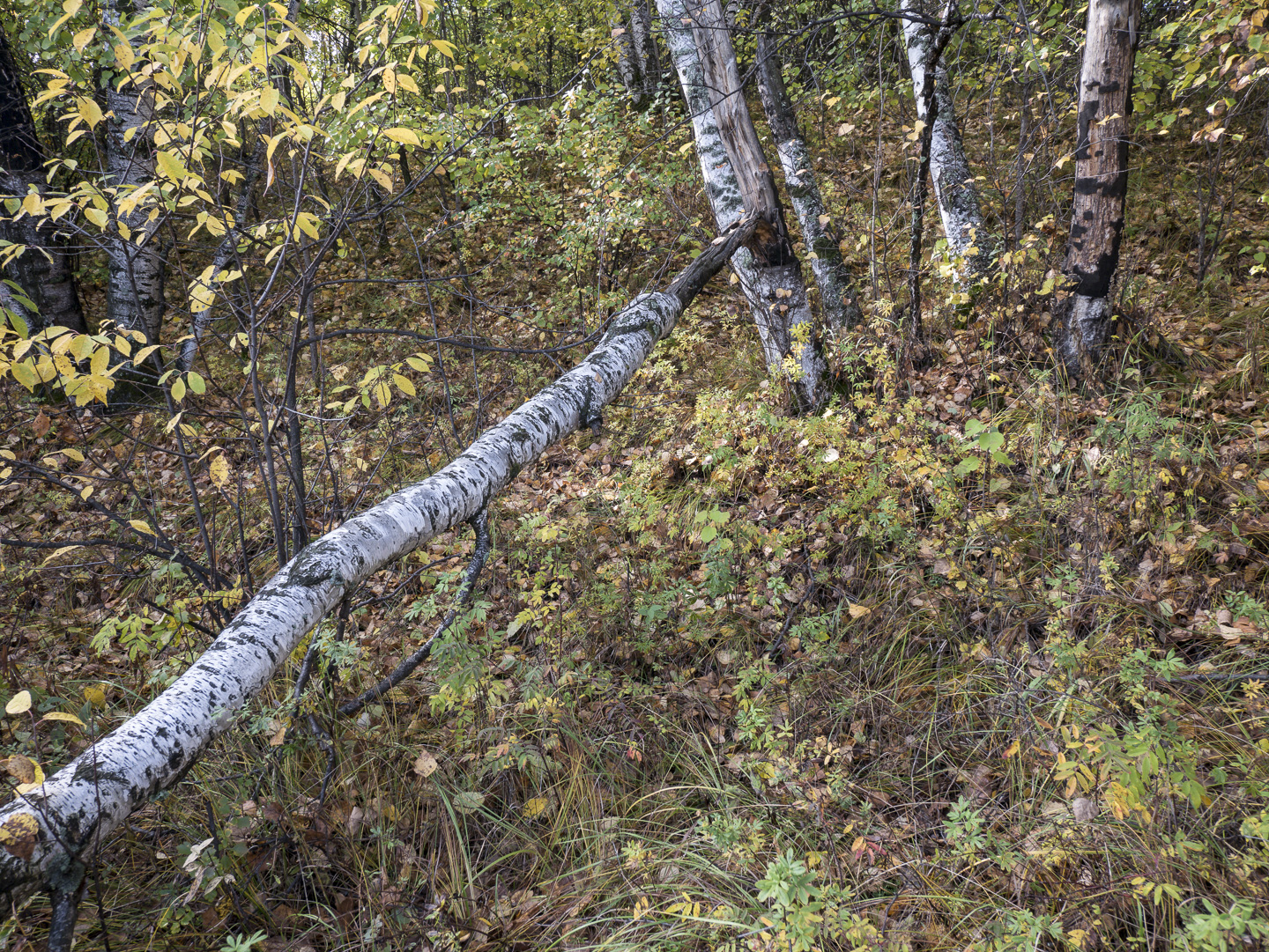
Original digital capture
What I saw that I liked:A "leading line" composition. What I don't like in the picture:I've often suggested that it's a good practice in the field to make both a landscape orientation and a portrait orientation version of the same subject. You never know which you might need — or which you might later prefer! The landscape version of this shot has too much empty space on the right side of the image that isn't contributing anything. In retrospect, I much prefer the vertical version at left. What I learned:If you had asked me in the field which I thought was going to be the better of the two, I would have said the horizontal one. Trust, just make both variations and decide later. 2nd Chances: What I might try nextI'd like to darken the forest floor and make this light tree stand out more. This would require some detailed Photoshop work. Perhaps on the next rainy day when I have some time. |