Every Picture Is a Compromise
Lessons from the Also-rans
Most photography websites show the photographer's very best work. Wonderful. But that's not the full story of a creative life. If we want to learn, we'd better pay attention to the images that aren't "greatest hits" and see what lessons they have to offer. Every picture is a compromise — the sum of its parts, optical, technical, visual, emotional, and even cosmic – well, maybe not cosmic, but sometimes spiritual. Success on all fronts is rare. It's ok to learn from those that are not our best.
This is a series about my also-rans, some of which I've been able to improve at bit (i.e., "best effort"), none of which I would consider my best. With each there are lessons worth sharing, so I will.
|
Original digital capture
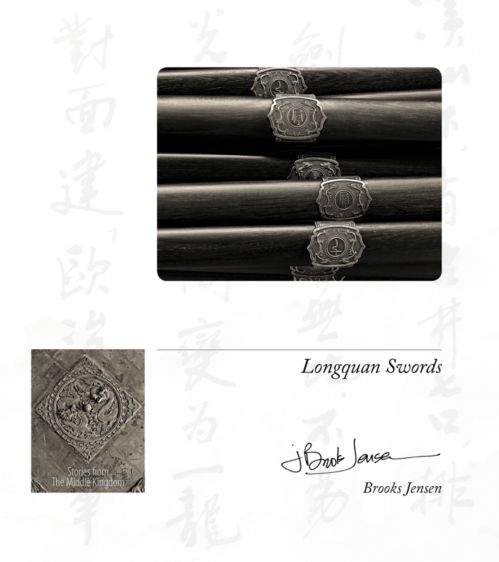
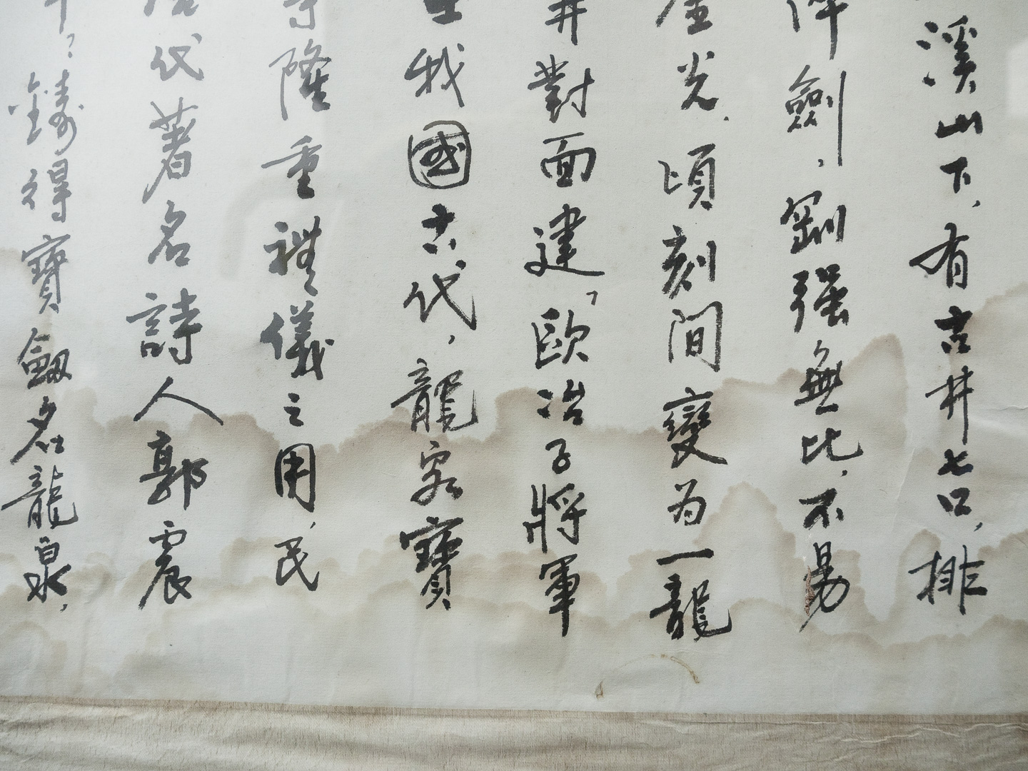
What I saw that I liked:If I haven't discussed this idea already, I should have. This bit of water-stained calligraphy was outside a sword-making factory in China. I thought I could use it as a faint background in a chapbook project. Even if it was a bad idea, why not snap off an image just in case? You never know. What I learned:The image at left is a ghosted version of the original, done simply with tonal adjustements using the tone curve. It can be a bit tricky to get just the right shade of gray, but it's pretty easy to test until it's just right. Below is this image used as a background on the title page of the chapbook. Don't you think it adds a nice element of layout and design that's more interesting than just plain white? 2nd Chances: What I might try nextI've now made this a regular part of my field work — looking for these kinds of backgrounds that I can use in layout and design that I have no intention of ever using as a straight image. Backgrounds are everywhere! Seriously, just keep it in mind and you see them everytime you are out photographing.
|