Every Picture Is a Compromise
Lessons from the Also-rans
Most photography websites show the photographer's very best work. Wonderful. But that's not the full story of a creative life. If we want to learn, we'd better pay attention to the images that aren't "greatest hits" and see what lessons they have to offer. Every picture is a compromise — the sum of its parts, optical, technical, visual, emotional, and even cosmic – well, maybe not cosmic, but sometimes spiritual. Success on all fronts is rare. It's ok to learn from those that are not our best.
This is a series about my also-rans, some of which I've been able to improve at bit (i.e., "best effort"), none of which I would consider my best. With each there are lessons worth sharing, so I will.
|
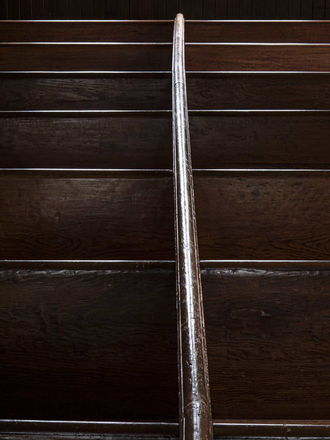
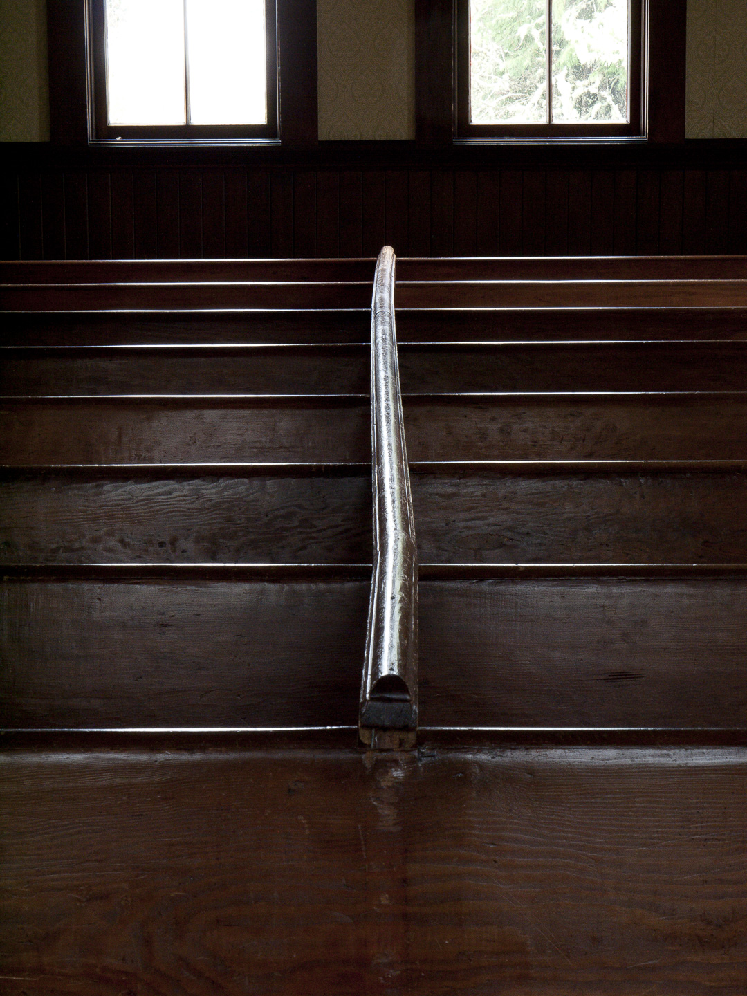
Original digital capture
What I saw that I liked:The sheen on these church pews is great! The simple austerity is perfect. What I don't like in the picture:The windows at the top were clearly a distraction that needed to be eliminated — which led to the much better composition at left. What I learned:I've often said that the first step in composition is to get rid of the unnecessary. It's amazing how often that leads to another bit of unnecessary. In this case, changing my position to eliminate the windows also brought me closer eliminating that space at the bottom. Notice now that the vertical rail runs to the lower edge of the photo where as in the original above it stops before the bottom edge of the image. The second composition also puts a bit more emphasis on the curvature of that rail — all of which, to my eye, makes the one at left much, much more compelling. 2nd Chances: What I might try nextI still haven't used this image in a project. I need to do so. |